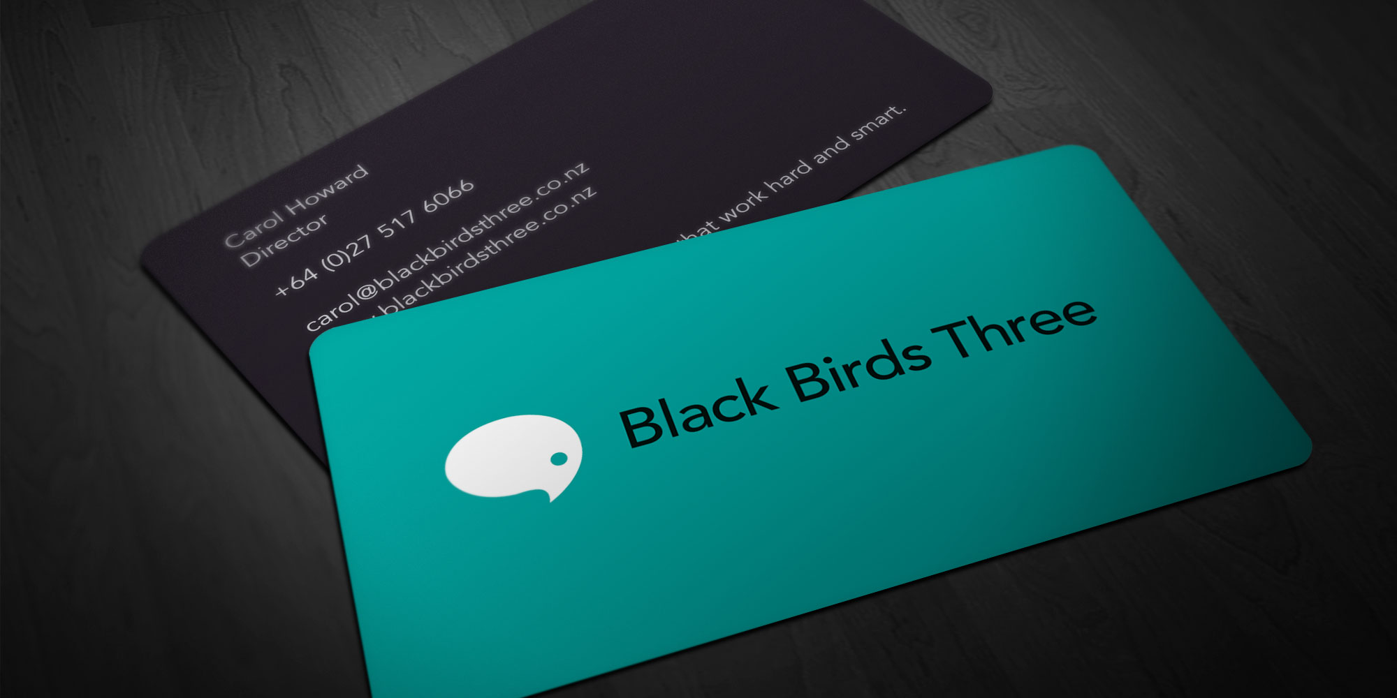
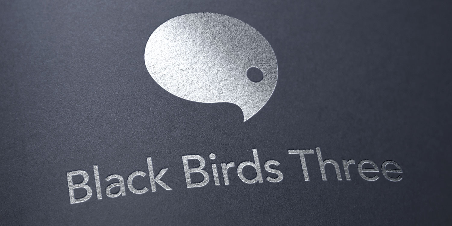
Black Birds Three is a new employee communications company that, just like its name, is a little bit different. This called for a corporate identity that represented its fresh approach and also set it apart in the marketplace. As soon as the speech bubble that looks like a bird was created, everyone quickly identified it as the perfect (and deceptively simple) representation of the brand.
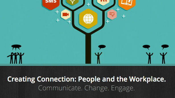
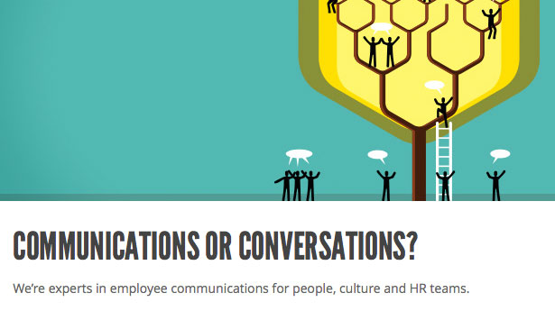
Universal Head applied the identity to clean, sharp, double-sided matt-varnished business cards with rounded corners, and also produced an elegant and flexible WordPress site to support content updates and social media integration. The client was given a hands-on introduction to the functionality offered by the site, including how to post and format articles in the blog section.
Universal Head has delivered a wonderful result in meeting a brief that required a simple, strong and compelling corporate identity. The logo was an immediate hit. It is subtle, has impact and people respond to it quickly. Our website is just as requested—simple, polished and flexible.
